Plotting
CasysPlot is the plotting tool, allowing to
perform predefined actions as well as exposing underlying libraries for advanced
customization.Note
Creating plots
From NadirData
CasysPlot.CasysPlot is a plotting tool, allowing simple predefined actions as well
as exposing the matplotlib axis for more advanced customizations.
Parameters
----------
data
Data container object from which to extract plot data or PlotContainer object.
data_name
Name of the data in the data container object.
stat
Name of the statistic to extract.
template
Parameters template to use.
This template will be overloaded with provided plot, text and data parameters.
plot_params
Plot parameters.
text_params
Text parameters.
data_params
Data parameters.
kwargs
Additional parameters used to generate the plot.
When used to create a plot from a computed diagnostic, these additional
parameters are passed to the ``container.get_data`` method.
The description of these parameters can be found in each add_diagnostic
method's documentation.
When used to create a direct plot from non-computed data, these parameters
might contain the following elements:
field
Field for which to create a raw_data diagnostic.
x
Field to use as x-axis (raw comparison diagnostic).
y
Field to use as y-axis (raw comparison diagnostic).
start
Starting time.
end
Ending time.
Using computed diagnostics
data_name parameter with an
existing diagnostic name.from casys import CasysPlot
plot = CasysPlot(data=ad, data_name="SIG0 pass", stat="mean")
Direct data reading
Along track plot:
from casys import CasysPlot, DateHandler, PlotParams
plot = CasysPlot(
data=ad,
data_name="Test",
field=ad.fields["SIGMA0.ALTI"],
plot="map",
)
Raw comparison plot:
s = DateHandler.from_orf("C_J3_GDRD", 122, 1, pos="first")
e = DateHandler.from_orf("C_J3_GDRD", 122, 1, pos="last")
plot = CasysPlot(
data=ad,
data_name="Test",
x=ad.fields["LATITUDE"],
y=ad.fields["SIGMA0.ALTI"],
start=s,
end=e,
)
From a xarray dataset
CasysPlot features on any
kind of data, CasysPlot can be created from any
data that can fit in a xarray Dataset
or DataArrayfrom_array() method.Create a CasysPlot object from a xarray Dataset or DataArray.
Parameters
----------
name
Name of the plot.
data
Plot data.
dtype
Type of plot:
- STAT_TIME: Along time data.
- STAT_BINNED: Binned data.
- STAT_BINNED_2D: 2D binned data.
- STAT_BINNED_2D_CURVE: 2D binned data, set of curves.
- STAT_BINNED_2D_SURFACE: 2D binned data in 3d, surface.
- STAT_BINNED_2D_BOX3D: 2D binned data in 3d, surface by boxes.
- STAT_HISTO: Histogram data.
- RAW_DATA: Raw data
- RAW_DATA_3D_SCATTER: Raw data in 3d, surface.
- RAW_DATA_3D_SURFACE: Raw data in 3d, scatter.
- RAW_COMPARISON: Raw data
- RAW_COMPARISON_3D_SCATTER: Raw data in 3d, surface.
- RAW_COMPARISON_3D_SURFACE: Raw data in 3d, scatter.
- STAT_GEOBOX: Geographically binned data.
- STAT_SCATTER: Scatter data.
x
x-axis field.
y
y-axis field.
z
z-axis field.
time
Time axis field's name (only required for raw data's map plots).
index
Data's index name (only required for raw data's map plots).
stat
Statistic type.
template
Parameters template to use.
This template will be overloaded with provided plot, text and data
parameters.
data_params
Plot's data parameters.
plot_params
Plot's visualization parameters.
text_params
Text parameters.
params_level
Properties level at which provided parameters has to be normalized.
kwargs
Additional specific parameters for the PlotContainer.
Returns
-------
:
A CasysPlot object.
dtype are:
raw_data: classic plot for raw data
raw_data_3d_scatter: 3d scatter plot for raw data
raw_data_3d_surface: 3d surface plot for raw data
raw_comparison: classic plot for raw comparison
raw_comparison_3d_scatter: 3d scatter plot for raw comparison
raw_comparison_3d_surface: 3d surface plot for raw comparison
stat_time: curve plot for per day, pass, cycle statistics and other along time plot
stat_binned: plot for 1d binning data
stat_binned_2d: classic plot for 2d binning data
stat_binned_2d_curve: plotting set of curves for 2d binning data
stat_binned_2d_surface: 3d surface plot for 2d binning data
stat_binned_2d_box3d: 3d surface plot with one surface by bins for 2d binning data
stat_histo: plot for histogram data
stat_geobox: classic plot for 2d geographical (longitude, latitude) binning data
stat_scatter: plot for x vs y scatter data
stat are:
value (not a statistic, just a raw value)
count
mean
median
std
var
from casys import CasysPlot
import xarray as xr
ds = xr.open_zarr(os.path.join(os.environ["RESOURCES_DIR"],"data_C_J3_B.zarr")).load()
plot = CasysPlot.from_array(
name="Time plot",
data=ds,
dtype="stat_time",
x="time",
y="WTC_rad",
stat="value"
)
plot.show()

Displaying plots
from casys import CasysPlot

plot = CasysPlot(data=ad, data_name="SIG0 pass", stat="mean")
plot.show()

%matplotlib widget directive.%matplotlib inline.Customizing plots
CasysPlot methods.Figure’s dimensions
set_size() method allows to change the
size of a plot.Set the figure size.
Parameters
----------
width
Width of the figure.
height
Height of the figure.
from casys import CasysPlot

plot = CasysPlot(
    data=ad,
    data_name="SIG0 pass",
    stat="mean",
)

plot.set_size(width=7, height=5)
plot.show()

Axes
Label’s text
set_xlabel() method allows to change the
text the label of the x-axis.Set the text of the x-axis label.
Parameters
----------
xlabel
xlabel of the figure
from casys import CasysPlot

plot = CasysPlot(
    data=ad,
    data_name="SIG0 pass",
    stat="mean",
)
plot.set_xlabel("Custom xlabel")
plot.show()

set_ylabel() allows to change the text
the label of the y-axis.Set the text of the y-axis label.
Parameters
----------
ylabel
ylabel of the figure
plot.set_ylabel("Custom ylabel")
plot.show()

Ticks’ values
set_ticks() method allows to change
ticks’ values of existing axes or create new axes.Change ticks parameters on specified axis.
Parameters
----------
position
Position of the axis on which to change the ticks (default to bottom axis).
fmt
Cycle / pass format to display ('C', 'P' or 'CP').
params
Additional text formatting options.
Example: Changing an existing temporal axis to display pass numbers
from casys import CasysPlot, PlotParams

plot = CasysPlot(
    data=ad,
    data_name="SIG0 pass",
    stat="mean",
    plot_params=PlotParams(grid=False),
)

plot.set_ticks(fmt="P", position="bottom")
plot.show()

from casys import AxeParams

def custom_tick(value):
    return f"{int(value)}%"

axe_par = AxeParams(
    values=custom_tick
)
plot.set_ticks(position="left", params=axe_par)
plot.show()

Example: Adding a new axis to display the cycle/pass numbers
from casys import CasysPlot, PlotParams

plot = CasysPlot(data=ad, data_name="SIG0 pass", stat="mean")

plot.set_ticks(fmt="CP", position="top")
plot.show()

Tip
To change ticks on merged plots, use
set_ticks() once all plots were added.
Title’s text
set_title() method allows to change the
title of a plot.Set the figure title.
Parameters
----------
title
title of the figure.
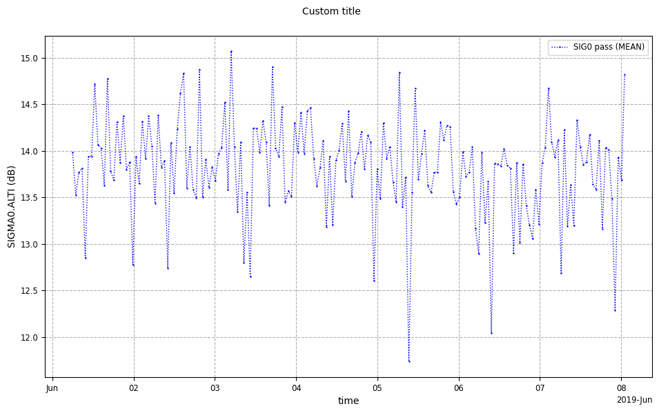
from casys import CasysPlot, PlotParams

plot = CasysPlot(
    data=ad,
    data_name="SIG0 pass",
    stat="mean",
    plot_params=PlotParams(line_style=":", marker_style="+", show_legend=True),
)

plot.set_title("Custom title")
plot.show()
Legend’s text
set_legend() method allows to set the
legend’s text of a plot.Set the figure legend.
Parameters
----------
legend
legend of the figure
Note
PlotParams show_legend parameter.# Setting legend
plot.set_legend("Custom legend")
# Display plot merged
plot.show()

Textual elements’ size
set_text_size() method allows to set
the size of many different plot’s elements.Resize all text elements of the figure. (except for events labels)
Parameters
----------
size
the new size.
elements
As a single element or a list of elements.
Possibilities are:
- "all"
- "title" (only title),
- "legend" (legend),
- "axes_labels" (labels of axes),
- "bars_labels" (labels of stat and color bar),
- "axes_ticks" (ticks of axes),
- "bars_ticks" (ticks of color bar)
plot.set_text_size(elements=["title", "axes_labels"], size="xx-large")
plot.show()

Ticks’ space
add_ticks_space() method allows to add
the provided space for ticks.Add space for ticks at the given position.
Parameters
----------
space
Space to add.
position
Position where to add space.
plot.add_ticks_space(space=0.05, position="bottom")
plot.show()

Saving a figure
save_figure() method allows to save
plots as pictures or any file format available to the underlying
matplotlib function.Save this CasysPlot figure at the provided path. Generate a default
one if not already generated.
Parameters
----------
path
Path to the file where to save the figure.
kwargs
Additional parameters passed to the underlying matplotlib save_fig method.