Click here to download this notebook.
How to customize a CasysPlot
CasysPlot objects and their elements (stat_bar, hist_bar, color_bar, stat_graph, …) can be customized through various methods and parameters. This notebook will show some examples.
[2]:
from casys import (
    AxeParams,
    CasysPlot,
    DateHandler,
    Field,
    NadirData,
    PlotParams,
    TextParams,
)

NadirData.enable_loginfo()
How to customize text elements on a plot
TexParams is an object allowing to customize text elements of plots.
TextParams parameters can be strings, or dictionaries:
[5]:
text = TextParams(xlabel="the time", ylabel="the SLA", title="a title")
[6]:
sladay_mean_plot = CasysPlot(
    data=ad, data_name="SLA day", stat="mean", text_params=text
)

sladay_mean_plot.show()
[6]:
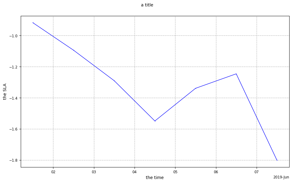
A single TextParams instance can be used to set multiple plots if you do not include titles in them
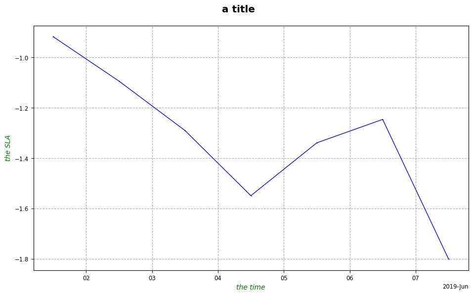
[7]:
text = TextParams(
    xlabel={"color": "g", "style": "italic"},
    ylabel={"color": "g", "style": "italic"},
    title={"size": "x-large", "weight": "bold"},
)
[8]:
sladay_mean_plot.set_text_params(text)

sladay_mean_plot.show()
[8]:
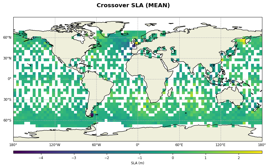
[9]:
sla_cross_mean_plot = CasysPlot(data=ad, data_name="Crossover SLA", stat="mean")
sla_cross_mean_plot.show()
sla_cross_mean_plot.set_text_params(text)
sla_cross_mean_plot.show()
[9]:
[10]:
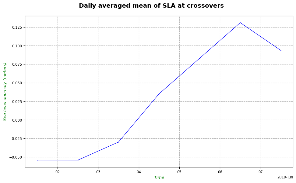
text = TextParams(
    xlabel={"xlabel": "Time", "color": "g", "style": "italic"},
    ylabel={"ylabel": "Sea level anomaly (meters)", "color": "g", "style": "italic"},
    title={
        "t": "Daily averaged mean of SLA at crossovers",
        "size": "x-large",
        "weight": "bold",
    },
)
[11]:
sla_cross_mean_plot = CasysPlot(
    data=ad, data_name="Crossover SLA", freq="day", stat="mean", text_params=text
)

sla_cross_mean_plot.show()
[11]:
How to customize axes, color bar or stat bar
AxeParams is an object allowing to customize ticks axes, color bar, stat bar…
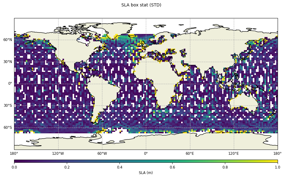
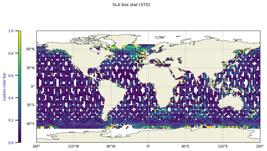
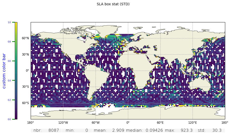
Map plot configuration
This is a plot with very basic PlotParams, but no AxeParams defined:
[12]:
slabox_stat = CasysPlot(
    data=ad,
    data_name="SLA box stat",
    stat="std",
    plot_params=PlotParams(color_limits=(0, 1)),
)

slabox_stat.show()
[12]:
Configuring the color bar
To configure the default the color bar parameters, we need to define an AxeParams:
[13]:
cb_params = AxeParams(
    label="SLA (m)",
    values={
        "ticks": [0.3, 0.45, 0.8],
        "labels": ["low value", "medium value", "high value"],
    },
    position="top",
)
And set it to the color_bar property of the PlotParams:
[14]:
plot_par = PlotParams(
    color_limits=(0, 1),
    grid=True,
    fill_ocean=False,
    mask_land=True,
    color_bar=cb_params,
)

slabox_stat.set_plot_params(plot_par)
slabox_stat.show()
[14]:
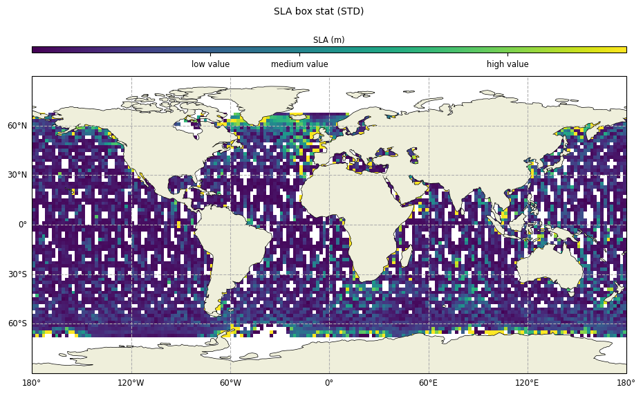
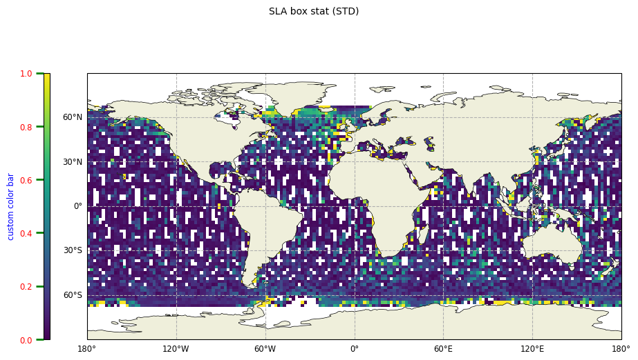
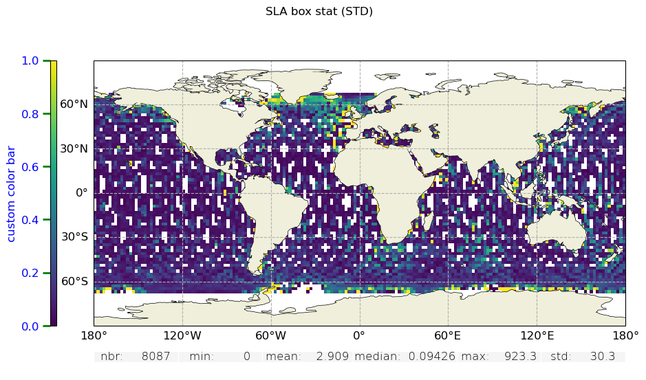
Another way of configuring the color bar is to use the add_color_bar() method:
[15]:
cb_params = AxeParams(
    label={"label": "custom color bar", "size": "small", "color": "b"},
    ticks={
        "labelsize": "small",
        "labelcolor": "r",
        "width": 2,
        "size": 8,
        "color": "g",
    },
)
[16]:
slabox_stat.add_color_bar(
    position="left",
    params=cb_params,
)

slabox_stat.show()
[16]:
Minor and major ticks are also customizable separately:
[17]:
cb_params = AxeParams(
    label={"label": "custom color bar", "size": "small", "color": "b"},
    ticks={
        "labelsize": "small",
        "labelcolor": "r",
        "width": 2,
        "size": 8,
        "color": "g",
    },
    ticks_major={"labelcolor": "b"},
)
[18]:
slabox_stat.add_color_bar(
    position="left",
    params=cb_params,
)

slabox_stat.show()
[18]:
General ticks parameters are applied first then minor and major ticks.
Customizing the statistics bar
To add the customized statistics bar, we need to define an AxeParams:
[19]:
sb_params = AxeParams(label={"fontsize": "small", "weight": "light"}, position="bottom")
And set it to the add_stat_bar method:
[20]:
slabox_stat.add_stat_bar(params=sb_params, position="bottom")

slabox_stat.show()
[20]:

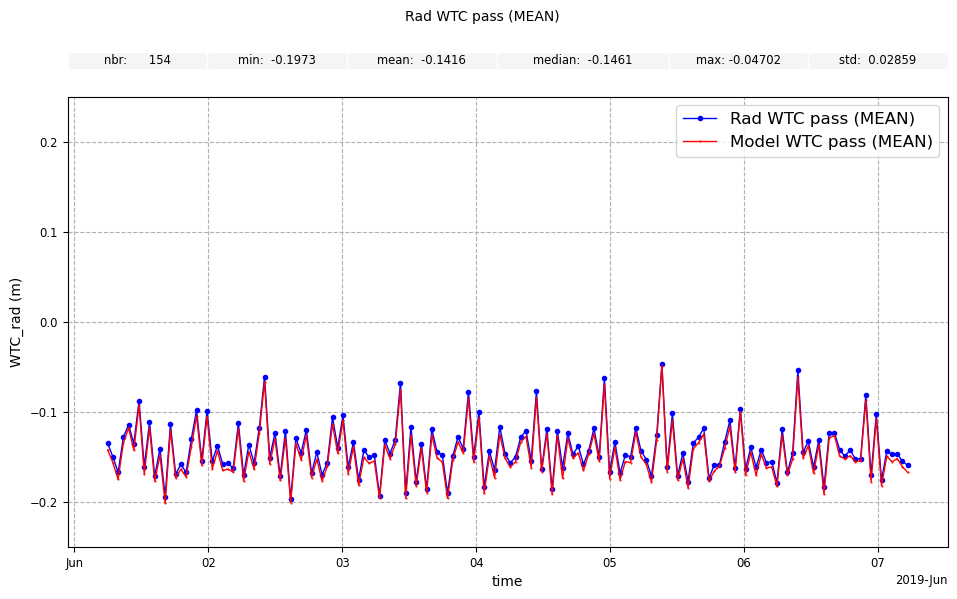
Graphic plot configuration
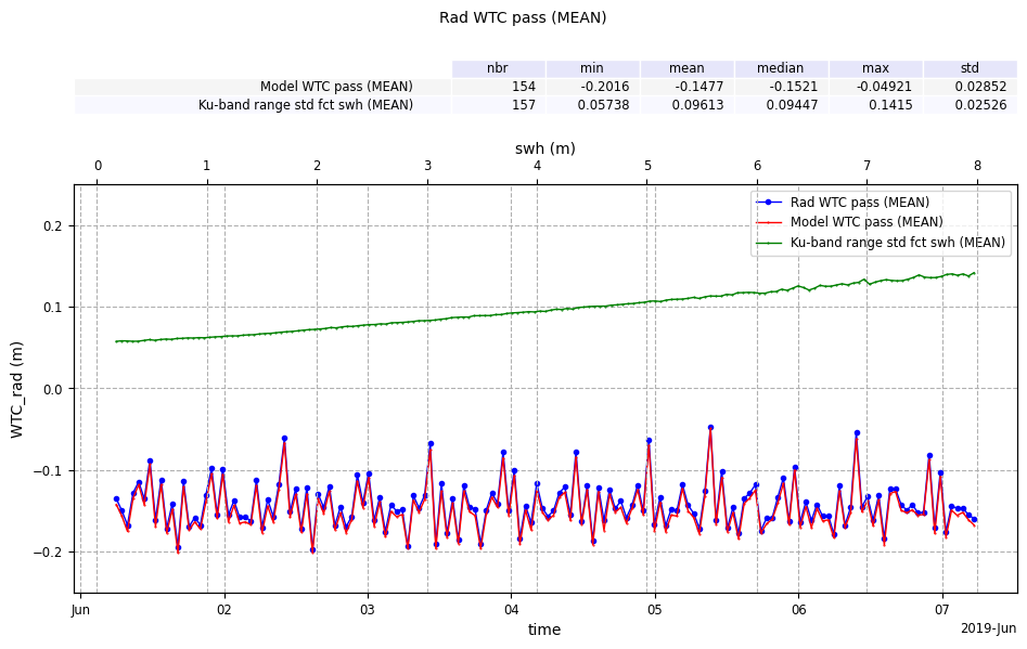
Here is an example of customizing a graph that is a merging of several plots:
Creation of the 3 plots:
[21]:
wtcrad_pass_plot = CasysPlot(
    data=ad,
    data_name="Rad WTC pass",
    stat="mean",
    plot_params=PlotParams(
        y_limits=(-0.25, 0.25), line_style="-", marker_style=".", marker_size=6
    ),
)

wtcmod_pass_plot = CasysPlot(data=ad, data_name="Model WTC pass", stat="mean")

rangestd_fctSWH_plot = CasysPlot(
    data=ad, data_name="Ku-band range std fct swh", stat="mean"
)
Add a stat bar to “wtcmod_pass_plot” and merge it with “wtcrad_pass_plot”, sharing all axes
[22]:
wtcmod_pass_plot.add_stat_bar()
wtcrad_pass_plot.add_plot(wtcmod_pass_plot, shared_ax="all")
Add a stat bar to “rangestd_fctSWH_plot” and merge it with “wtcrad_pass_plot”, sharing only the y axe
[23]:
rangestd_fctSWH_plot.add_stat_bar()
wtcrad_pass_plot.add_plot(rangestd_fctSWH_plot, shared_ax="y")
Display…
[24]:
wtcrad_pass_plot.show()
[24]:
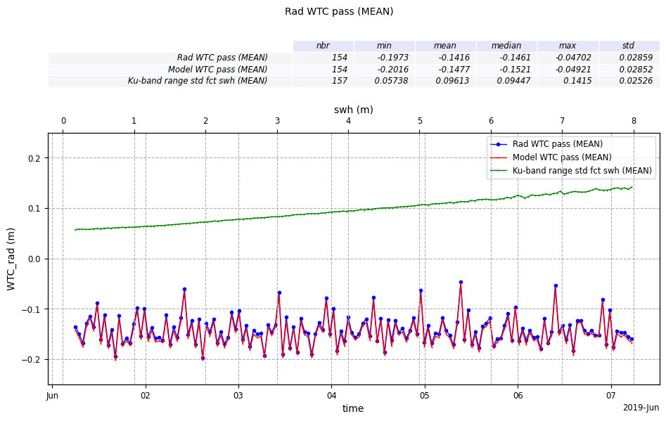
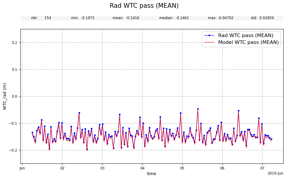
Customizing the statistics bar
[25]:
wtcrad_pass_plot.add_stat_bar(
    params=AxeParams(label={"style": "italic", "size": "small"})
)

wtcrad_pass_plot.show()
[25]:
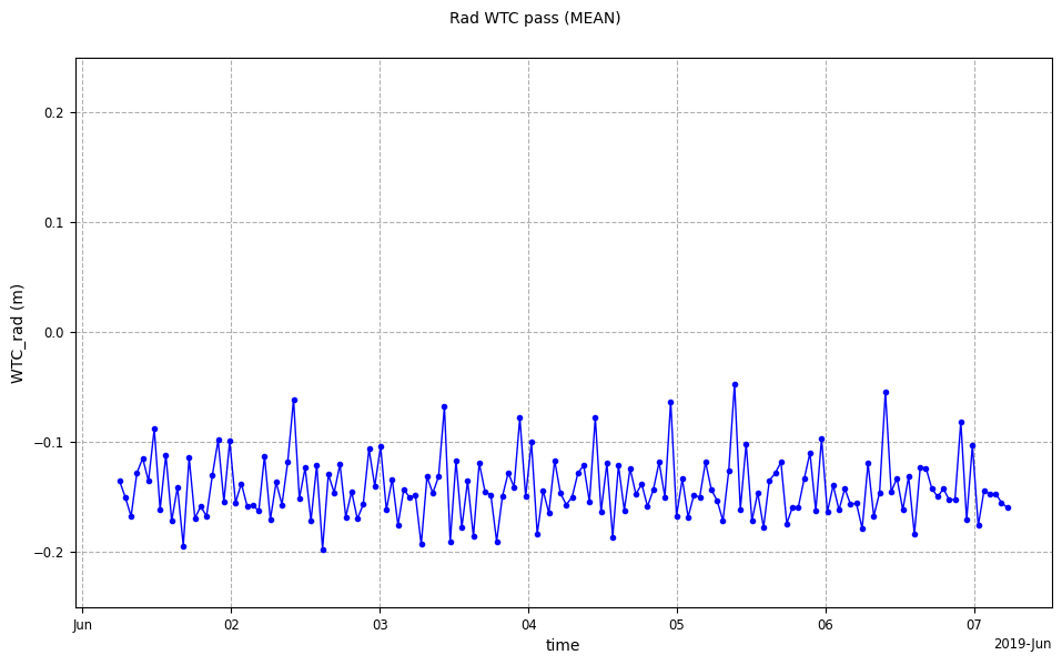
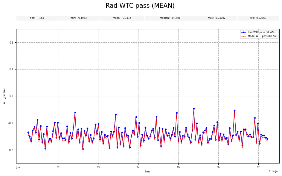
Setting altimetric ticks with AxeParams
[26]:
wtcrad_pass_plot = CasysPlot(
    data=ad,
    data_name="Rad WTC pass",
    stat="mean",
    plot_params=PlotParams(
        y_limits=(-0.25, 0.25), line_style="-", marker_style=".", marker_size=6
    ),
)

wtcrad_pass_plot.show()
[26]:
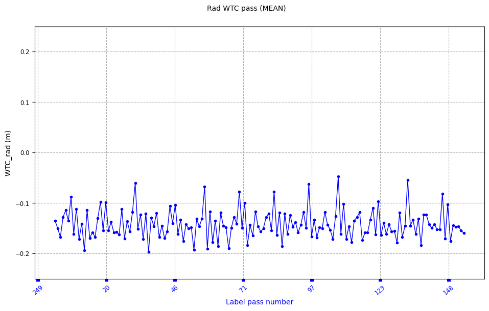
Pass altimetric ticks on bottom axe
[27]:
wtcrad_pass_plot.set_ticks(
    position="bottom",
    fmt="P",
    params=AxeParams(
        label={"label": "Label pass number", "color": "b"},
        ticks={"color": "b", "labelrotation": 40, "width": 5, "labelcolor": "b"},
    ),
)

wtcrad_pass_plot.show()
[27]:
[28]:
wtcrad_pass_plot.add_ticks_space(space=0.05, position="bottom")
wtcrad_pass_plot.show()
[28]:

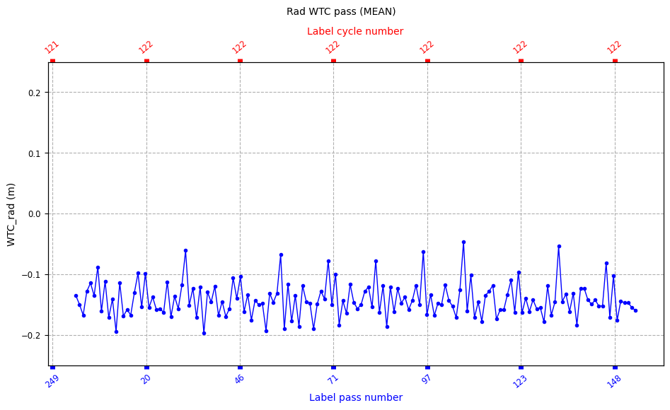
Cycle altimetric ticks on top axe
[29]:
wtcrad_pass_plot.set_ticks(
    position="top",
    fmt="C",
    params=AxeParams(
        label={"label": "Label cycle number", "color": "r"},
        ticks={"color": "r", "labelrotation": 40, "width": 5, "labelcolor": "r"},
    ),
)

wtcrad_pass_plot.show()
[29]:
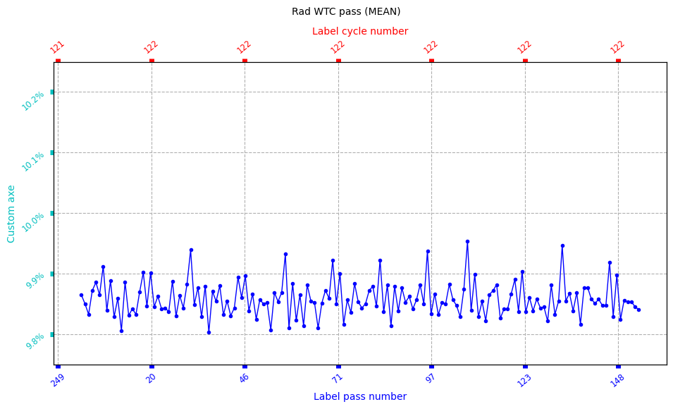
Setting customized ticks with AxeParams
[30]:
def custom_tick(value):
    return f"{float(value)+10}%"


wtcrad_pass_plot.set_ticks(
    params=AxeParams(
        position="left",
        label={"label": "Custom axe", "color": "c"},
        ticks={"color": "c", "labelrotation": 40, "width": 5, "labelcolor": "c"},
        values=custom_tick,
    ),
)

wtcrad_pass_plot.show()
[30]:
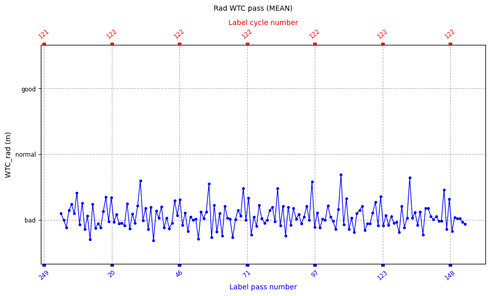
[31]:
wtcrad_pass_plot.set_ticks(
    position="left",
    params=AxeParams(
        values={"ticks": [-0.15, 0, 0.15], "labels": ["bad", "normal", "good"]}
    ),
)

wtcrad_pass_plot.show()
[31]:
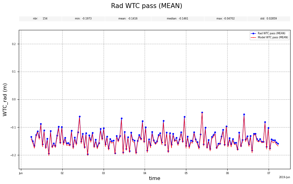
How to configure elements sizes
set_text_size changes the size of the elements of the plot according to the provided parameters.
[32]:
wtcrad_pass_plot = CasysPlot(
    data=ad,
    data_name="Rad WTC pass",
    stat="mean",
    plot_params=PlotParams(
        y_limits=(-0.25, 0.25), line_style="-", marker_style=".", marker_size=6
    ),
)

wtcmod_pass_plot = CasysPlot(data=ad, data_name="Model WTC pass", stat="mean")

wtcrad_pass_plot.add_plot(wtcmod_pass_plot)
wtcrad_pass_plot.add_stat_bar()

wtcrad_pass_plot.set_text_size(elements="legend", size="large")
wtcrad_pass_plot.show()
[32]:
[33]:
wtcrad_pass_plot.set_text_size(elements="title", size=15)
wtcrad_pass_plot.show()
[33]:
[34]:
wtcrad_pass_plot.set_text_size(
    elements=["legend", "axes_ticks", "axes_labels", "bars_labels"], size="xx-small"
)

wtcrad_pass_plot.show()
[34]:
[35]:
wtcrad_pass_plot.set_text_size(elements=["axes_labels"], size="large")

wtcrad_pass_plot.show()
[35]:
[36]:
slabox_stat.set_text_size(elements="bars_labels", size="large")
slabox_stat.show()
[36]:

[37]:
slabox_stat.set_text_size(elements="bars_ticks", size="xx-small")
slabox_stat.show()
[37]:
[38]:
slabox_stat.set_text_size(elements="all", size="large")
slabox_stat.show()
[38]:
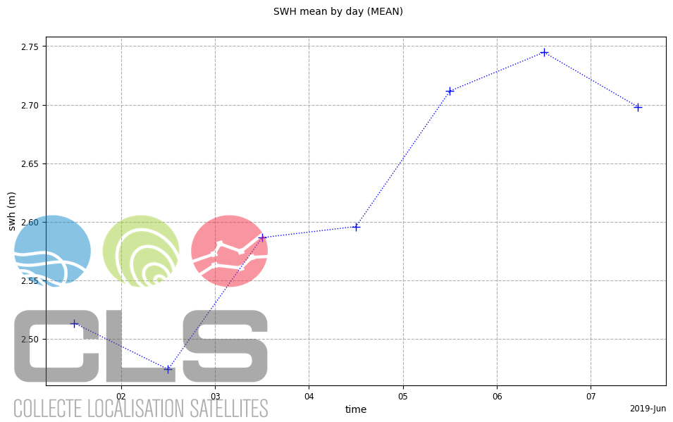
How to add watermarks to a plot
add_watermark allows to add a watermark (a logo) to a plot.
[39]:
pparams = PlotParams(line_style=":", marker_style="+", marker_size=8, grid=True)
file = "../../resources/CLS-Logo.png"
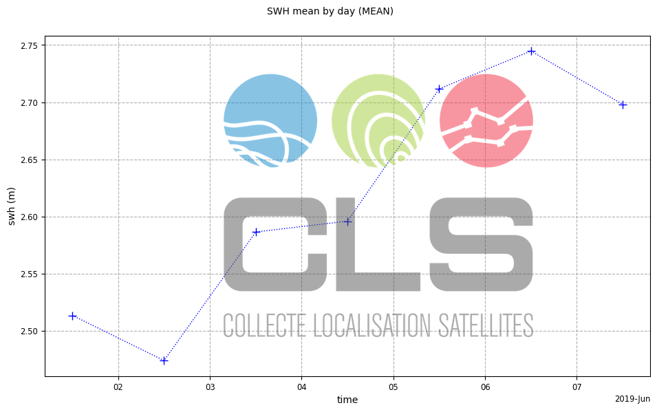
Size in pixels, and transparency
[40]:
plot = CasysPlot(
    data=ad,
    data_name="SWH mean by day",
    stat="mean",
    plot_params=pparams,
)
plot.add_watermark(
    image=file,
    image_size=(400, 300),
    alpha=0.5,
)
plot.show()
[40]:
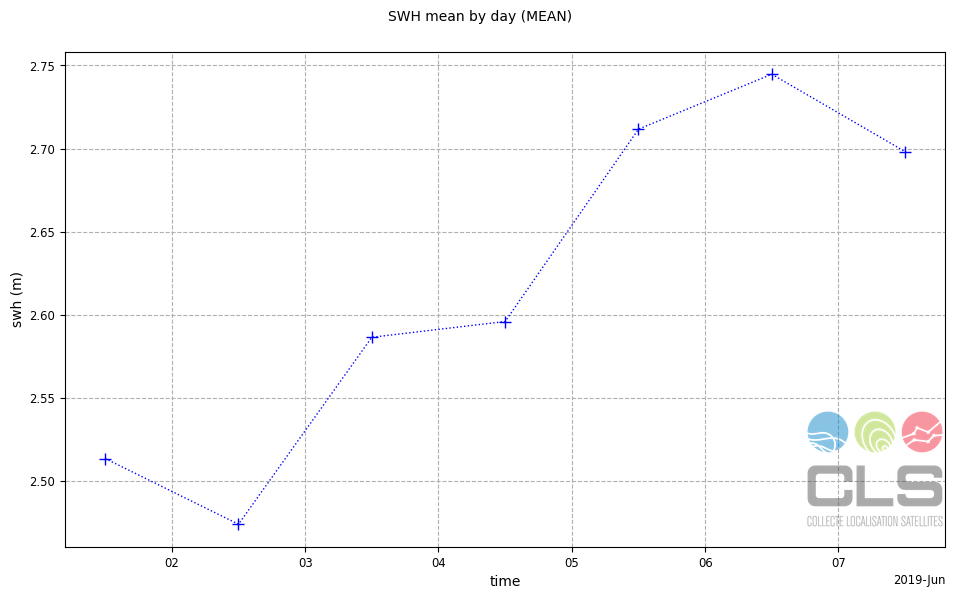
Height in pixels, position and transparency
[41]:
plot = CasysPlot(
    data=ad,
    data_name="SWH mean by day",
    stat="mean",
    plot_params=pparams,
)
plot.add_watermark(
    image=file,
    image_size=(None, 120),
    xo=800,
    yo=70,
    alpha=0.5,
)
plot.show()
[41]:
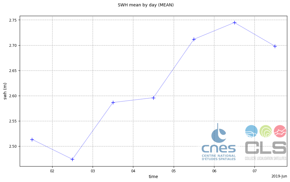
A second watermark
[42]:
file2 = "../../resources/CNES-Logo.jpg"
[43]:
plot.add_watermark(
    image=file2,
    image_size=(None, 140),
    xo=650,
    yo=60,
    alpha=0.5,
)
plot.show()
[43]:
Size in pourcentage of the figure’s width
[44]:
plot = CasysPlot(
    data=ad,
    data_name="SWH mean by day",
    stat="mean",
    plot_params=pparams,
)
plot.add_watermark(
    image=file,
    image_size=50,
    xo=300,
    yo=100,
    alpha=0.5,
)
plot.show()
[44]: