Histogram bars
The
add_hist_bar() method allows to add a
histogram bar.Histogram represents the data’s dispersion along the provide axis values.
The histogram y-axis limits can be set through the
y_limits parameter.Add a histogram graphic for the axis data.
This kind of graphic might be added to:
* Raw plots
* Time plots
* Scatter plots
* Geographical box plots
* 2D binned statistics plots
Parameters
----------
position
Position of the histogram graph (top, bottom, left, right)
(default to bottom).
for_axis
Name of the axis for which to compute and display this graphic (X, Y or Z).
Default value is the z-axis (Z).
y_limits
Limits for the "y-axis" of the histogram graphic to add.
params
Bar's parameters.
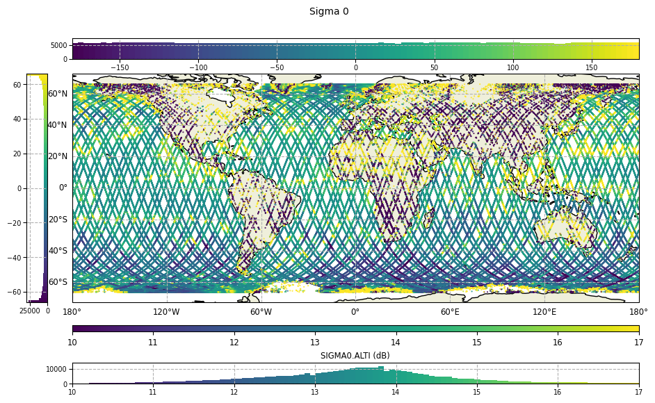
from casys import CasysPlot, PlotParams

plot = CasysPlot(
    data=ad,
    data_name="Sigma 0",
    plot="map",
    plot_params=PlotParams(color_limits=(10, 17)),
)

# Histogram on the top for the x-axis
plot.add_hist_bar(position="top", for_axis="x", y_limits=(0, 7500))

# Histogram on the left for the y-axis
plot.add_hist_bar(position="left", for_axis="y")

# Histogram on the bottom for the z axis (field values)
plot.add_hist_bar(position="bottom", for_axis="z", y_limits=(0, 14000))

plot.show()
Note
When using the
add_plot() method, y_limits
parameter value is specific to each hist_bar plot.