Color bar
Plots requiring a color bar will automatically add one.
The
add_color_bar() method allows to
configure the default color bar.Add a color bar.
Parameters
----------
position
Position of the colorbar (top, bottom, left, right)
- Default to bottom for maps
- Default to right for graphics
params
Bar's parameters.
Note
Color bar can be fully customized using AxeParams
and changed at CasysPlot creation through the
color_bar parameter of
PlotParams.from casys import AxeParams, CasysPlot, PlotParams
param = AxeParams(
label={
"label": "My Data",
"fontsize": "x-small",
"color": "red"
},
ticks={
"labelsize": "x-small",
"labelcolor": "blue",
"colors": "green",
"width": 5,
},
values={
"ticks": [0.1, 0.5, 0.7],
"labels": ["low value", "medium value", "high value"],
},
position="right",
)
plot = CasysPlot(
data=ad,
data_name="SLA box stat",
stat="std",
plot_params=PlotParams(color_bar=param, color_limits=(0, 1)),
)
plot.show()

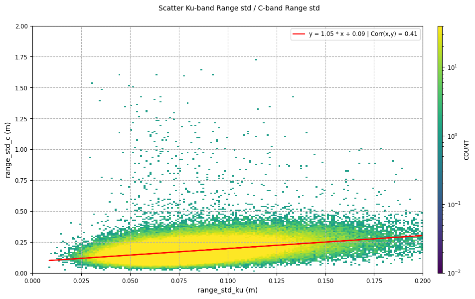
Tip
Using PlotParams kwargs_plot parameter
allows to define non linear color scales.
from matplotlib.colors import LogNorm
from casys import AxeParams, CasysPlot, PlotParams

plot = CasysPlot(
    data=ad,
    data_name="Scatter Ku-band Range std / C-band Range std",
    plot_params=PlotParams(
        kwargs_plot={"norm": LogNorm(vmin=0.01, vmax=40)},
    ),
)

plot.show()