PlotParams
PlotParams is the main parameters object allowing
to define the general properties of the plot.Set of parameters related to plot's visualization.
Parameters
----------
fig_width
Figure width (default to 10).
fig_height
Figure height (default to 6).
x_limits
Limit the plot view to the provided extent [x_min, x_max].
Default to (min, max).
The "auto" option allows to compute adapted color limits:
(mean-3*std, mean+3*std).
Use a tuple with the format ("p", (p_min, p_max)) or ("p", p_value) to fix
limits according to the percentiles in the data.
For p_value, the percentile limits (p_min, p_max) equivalence is:
( (100-value)/2, (100+value)/2 ).
y_limits
Limit the plot view to the provided extent [y_min, y_max].
Default to (min, max).
The "auto" option allows to compute adapted color limits:
(mean-3*std, mean+3*std).
Use a tuple with the format ("p", (p_min, p_max)) or ("p", p_value) to fix
limits according to the percentiles in the data.
For p_value, the percentile limits (p_min, p_max) equivalence is:
( (100-value)/2, (100+value)/2 ).
color_limits
Color bar minimum and maximum values. Default to (min, max).
The "auto" option allows to compute adapted color limits:
(mean-3*std, mean+3*std).
Use a tuple with the format ("p", (p_min, p_max)) or ("p", p_value) to fix
limits according to the percentiles in the data.
For p_value, the percentile limits (p_min, p_max) equivalence is:
( (100-value)/2, (100+value)/2 ).
color_map
Color mapping (default to viridis):
The following types and format are available, depending on the
discretize_cmap flag value.
When discretize_cmap is False:
- Custom ColorMap object from matplotlib.cm
- Name (as a string) of an existing colormap in matplotlib
When discretize_cmap is True:
- Custom ListedColorMap from matplotlib.cm
- Name of an existing matplotlib colormap (needs to be a ListedColorMap)
- List of:
- strings representing either a known color name ("red" or "b"), or
a hexadecimal value of a color ("#RRGGBBAA" or "#RRGGBB")
- tuple or list of ints in the 0-1 range, coding for an RGB/RGBA color
( (R, G, B, A) or (R, G, B) )
- None, resulting in no display for the corresponding value
- Dictionary specifying a correspondence value: color, respecting the color
coding described above. More values than those actually present in the
data can be provided in this dictionary.
discretize_cmap
Color mapping option (default to False):
- True: Discretize the colormap according to the data to display
- False: Keep current colormap
color_bar
Color bar specifications (default to True):
- True/False: Whether to display a bottom color bar or not.
- string: Label for a bottom color bar.
- AxeParams: Full specification for a color bar.
grid
Grid specification (default to True):
- True/False: Whether to display a grid or not.
- GridParam: Full specification of the grid.
show_reg
Display the regression curve (scatter).
show_legend
True: Force the legend to be displayed on single curve graphics.
False: Force the legend to be hidden on multi curve graphics.
None (default): Only display legend on multi curve graphics.
fill_land
Color continents (cartography).
fill_ocean
Color oceans (cartography).
mask_land
Hide continents data (cartography).
mask_ocean
Hide oceans data (cartography).
coastlines
Draw the coastlines with the provided parameters (cartography).
projection
Change the map projection.
color
Color of the plot.
marker_style
Plot markers style.
marker_size
Plot/scatter markers size.
line_style
Plot line style.
line_width
Plot line width.
bars
Display graphics as bars (Default: True for histograms, False otherwise).
kwargs_figure
Additional parameters passed to the underlying matplotlib Figure class.
kwargs_plot
Additional parameters passed to the underlying matplotlib plotting method.
level
Property level to use.
Warning
x and y limits might not correctly work when using a different projection:
use DataParams x and y limitations and let the
auto-zoom do the job.
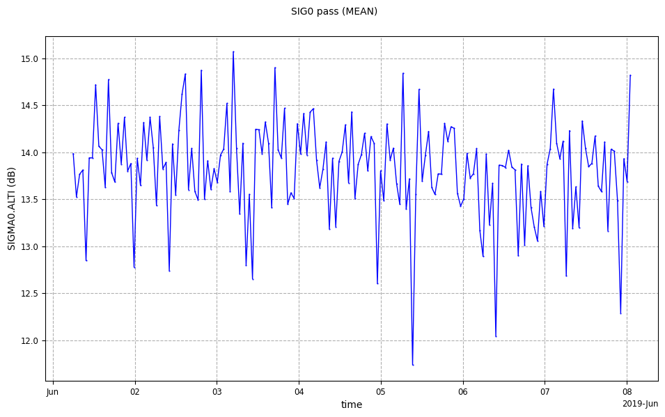
from casys import CasysPlot, PlotParams

plot = CasysPlot(data=ad, data_name="SIG0 pass", stat="mean")

plot.show()
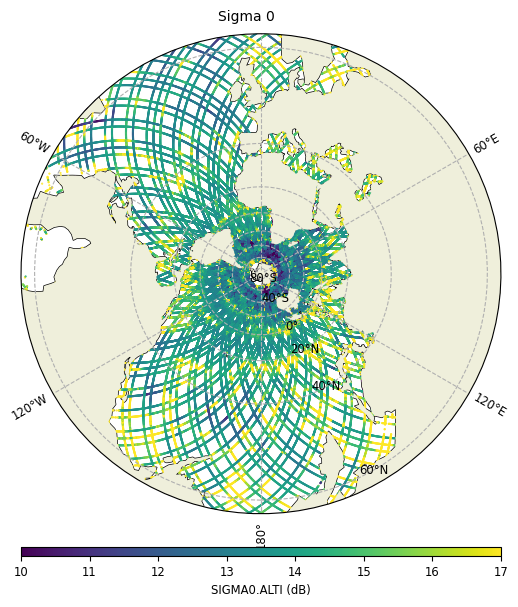
import cartopy.crs as ccrs

from casys import CasysPlot, PlotParams

param = PlotParams(
    color_limits=(10, 17),
    projection=ccrs.SouthPolarStereo(),
    mask_land=True
)

plot = CasysPlot(
    data=ad,
    data_name="Sigma 0",
    plot="map",
    plot_params=param
)
plot.show()
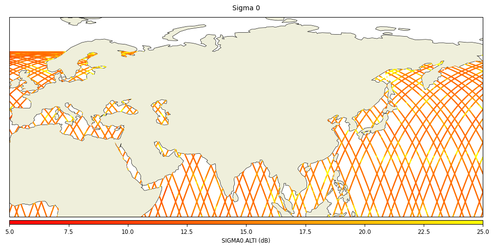
PlotParams can be set using the
set_plot_params() method on an existing plot.param2 = PlotParams(
fig_width=10,
fig_height=5,
x_limits=(-10, 180),
y_limits=(0, 80),
color_limits=(5, 25),
color_map="autumn",
mask_land=True,
projection=ccrs.PlateCarree(),
grid=False
)
plot.set_plot_params(param2)
plot.show()
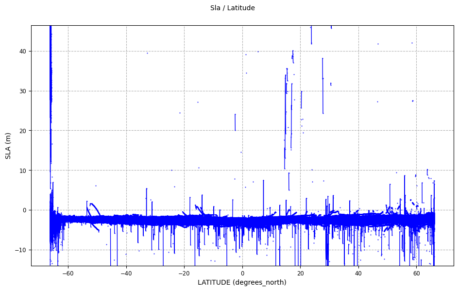
X and Y Limits
x_limits and y_limits allow to select the range along the x
and y-axis respectively, by using a tuple of (v_min, v_max) values.
(v_min, v_max)with:("p", (p_min, p_max))tuple withp_minandp_maxfloat values between 0 and 100, andp_min < p_max.p_min(resp.p_max) designates the minimum (resp. maximum) percentile values in the displayed data to include in the colorbar.("p", p_value)tuple withp_valuea float value between 0 and 100.This format is equivalent to a tuple("p", (p_min, p_max))withand
.
For instance,("p", (5, 95))<=>("p", 90).

param = PlotParams(y_limits=("p", (0.02, 99.8)), grid=True)

plot = CasysPlot(data=ad, data_name="Sla / Latitude", plot_params=param)

plot.show()
Color Limits
x_limits and y_limits, the color_limits parameter allows to
select the range of the colorbar using a tuple of (v_min, v_max) values.
(v_min, v_max)with:("p", (p_min, p_max))tuple withp_minandp_maxfloat values between 0 and 100, andp_min < p_max.p_min(resp.p_max) designates the minimum (resp. maximum) percentile values in the displayed data to include in the colorbar.("p", p_value)tuple withp_valuea float value between 0 and 100.This format is equivalent to a tuple("p", (p_min, p_max))withFor instance,("p", (5, 95))<=>("p", 90).
color_limits="auto".param = PlotParams(
color_limits="auto",
projection=ccrs.SouthPolarStereo(),
mask_land=True
)
plot = CasysPlot(
data=ad,
data_name="Sigma 0",
plot="map",
plot_params=param
)
plot.show()

color_limits parameter. Here ("p", (10, 90)) is equivalent("p", 80).import cartopy.crs as ccrs
from casys import CasysPlot, PlotParams
param = PlotParams(
color_limits=("p", (10, 90)),
projection=ccrs.SouthPolarStereo(),
mask_land=True
)
plot = CasysPlot(
data=ad,
data_name="Sigma 0",
plot="map",
plot_params=param
)
plot.show()

Discretized color map
discretize_cmap parameter is a flag related parameter.discretize_cmap = True, more input options are available to the
color_map parameter, as described in the PlotParams
docstring.Warning
discretize_cmap=True) the color_limits
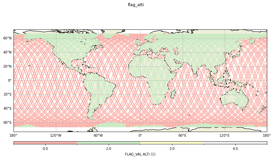
parameter is ignored.ad.add_raw_data(name="flag_alti", field=ad.fields["FLAG_VAL.ALTI"])
ad.compute()
plot = CasysPlot(
data=ad,
data_name="flag_alti",
plot="map",
plot_params=PlotParams(discretize_cmap=True),
)
plot.show()

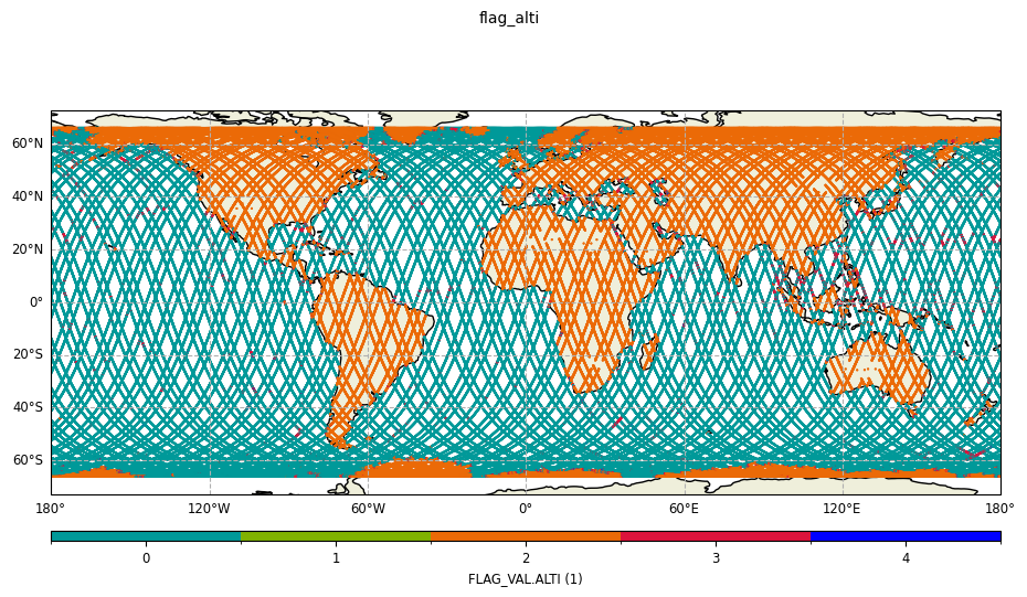
plot = CasysPlot(
    data=ad,
    data_name="flag_alti",
    plot="map",
    plot_params=PlotParams(discretize_cmap=True, color_map="Pastel1"),
)
plot.show()
params = PlotParams(
    discretize_cmap=True,
    color_map={0: (0, 0.60, 0.60), 1: (0.50, 0.70, 0), 2: "#eb6a07", 3: "crimson", 4: "b"},
)

plot = CasysPlot(
    data=ad,
    data_name="flag_alti",
    plot="map",
    plot_params=params,
)
plot.show()
Note
matplotlib known colors:
"red",RGB/RGBA hexadecimal code:
"#2CF9F2","#2CF9F211",RGB/RGBA tuple or list of numbers in the 0-1 range:
(0.2, 0.9, 0.4),(0.2, 0.9, 0.4, 0.9).
RGB/RGBA hexadecimals last 2 digits and RGB/RGBA tuples last number are optional
and stand for the alpha value (aka color transparency). 0 is full-transparency.Note
for a list of colors: colors are selected in order,
for a ListedColormap object (matplotlib registered colormap or a customized one): colors are selected evenly over the whole colormap
None as a color input in a color list result in hiding the
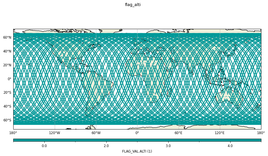
corresponding value.params = PlotParams(
discretize_cmap=True,
color_map={0: None, 1: (0.50, 0.70, 0), 2: "#eb6a07", 3: "crimson", 4: "b"},
)
plot = CasysPlot(
data=ad,
data_name="flag_alti",
plot="map",
plot_params=params,
)
plot.show()

params = PlotParams(
    discretize_cmap=True,
    color_map=[(0, 0.60, 0.60)],
)

plot = CasysPlot(
    data=ad,
    data_name="flag_alti",
    plot="map",
    plot_params=params,
)
plot.show()
FeatureParams
coastlines parameter allows to customize the coastlines used for the plot.coastlines parameter:
Boolean value
True: displaying classic coastlines (default value),Boolean value
False: hiding the coastlines,A dictionary describing the parameters used for the coastlines,
A
FeatureParamsobject described below.
Set of parameters relatives to the coastlines display in plot
visualisation.

Parameters
----------
feature
    Type of the feature.
feature_kwargs
    Parameters dictionary of the feature.
enabled
    Whether the coastlines are drawn or not.
FeatureParams parameters:
feature: default value atcoastline(natural earth coasltines), other value isgshhs
edgecolor: color of the displayed coastlines
linewidth: linewidth of the displayed coastlines
linestyle: linestyle of the displayed coastlines
zorder: allow to place coastlines above or below other features and plot elements (default value at 2)
scale: depending on the feature chosen, available scale values are:
“auto” (“a”), “coarse” (“c”), “low” (“l”), “intermediate” (“i”), “high” (“h”) for
gshhs“auto”, “10m”, “50m”, “110m” for ``coastline
levels: list of integers specific toGSHHScase with four levels available:
boundary between land and ocean
1boundary between lake and land
2boundary between island in lake and lake
3boundary between pond in island and island
4
Note
zorder parameter, choose a higher (resp. lower) zorder value than an element plot to drawn
coastlines above (resp. below) the element.zorder values are:
1.9 for land and ocean features
2 for the grid
1.8 for the data drawn
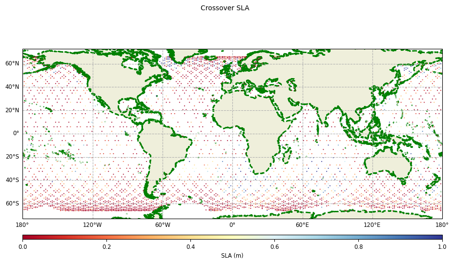
Without any value provided for the coastlines parameter, the default coastlines feature is displayed:
params = PlotParams(color_limits=(0, 1), color_map="RdYlBu")

plot = CasysPlot(
    data=ad,
    data_name="Crossover SLA",
    delta="field",
    plot_params=params,
)
plot.show()

Using a boolean at False allows to hide the coastlines.
params = PlotParams(
    color_limits=(0, 1),
    color_map="RdYlBu",
    coastlines=False,
)

plot = CasysPlot(
    data=ad,
    data_name="Crossover SLA",
    delta="field",
    plot_params=params,
)
plot.show()

Using customized Natural Earth coastlines feature:
params = PlotParams(
    color_limits=(0, 1),
    color_map="RdYlBu",
    coastlines={"edgecolor": "g", "linewidth":2, "linestyle": "--", "scale": "10m"},
)

plot = CasysPlot(
    data=ad,
    data_name="Crossover SLA",
    delta="field",
    plot_params=params,
)
plot.show()
Using GSHHS coastlines feature:
params = PlotParams(
    color_limits=(0, 1),
    color_map="RdYlBu",
    coastlines={
        "feature": "gshhs",
        "scale": "coarse",
        "levels":[1, 2, 3, 5, 6],  # all levels activated for antarctica coastlines display
    },
)

plot = CasysPlot(
    data=ad,
    data_name="Crossover SLA",
    delta="field",
    plot_params=params,
)
plot.show()

The GSHHS feature provides more detailed coastlines than the natural earth one:
from casys import create_image_grid

params = PlotParams(
    color_limits=(0, 1),
    color_map="RdYlBu",
    coastlines={"edgecolor": "g", "scale": "10m"},
    x_limits=(-74, -72.5),
    y_limits=(64, 65),
)
plot = CasysPlot(
    data=ad,
    data_name="Crossover SLA",
    delta="field",
    plot_params=params,
)

params_gshhs = PlotParams(
    color_limits=(0, 1),
    color_map="RdYlBu",
    color_bar=False,
    coastlines={"feature": "gshhs", "edgecolor": "purple", "scale": "high"},
    x_limits=(-74, -72.5),
    y_limits=(64, 65),
)
plot_gshhs = CasysPlot(
    data=ad,
    data_name="Crossover SLA",
    delta="field",
    plot_params=params_gshhs,
)

create_image_grid(
    figure_size=(15, 11),
    plots=[plot, plot_gshhs],
    columns_nb=2,
)
