Click here to download this notebook.
Temporal monitoring
[2]:
from casys.readers import CLSTableReader

from casys import (
    CasysPlot,
    DateHandler,
    Field,
    NadirData,
    PlotParams,
    RangeEvent,
    SimpleEvent,
    TextParams,
)

NadirData.enable_loginfo()
[3]:
# Reader definition
table_name = "TABLE_C_J3_B_GDRD"
orf_name = "C_J3_GDRD"
cycle_number = 127
start = DateHandler.from_orf(orf_name, cycle_number, 1, pos="first")
end = DateHandler.from_orf(orf_name, cycle_number, 254, pos="last")

reader = CLSTableReader(
    name=table_name,
    date_start=start,
    date_end=end,
    orf=orf_name,
    time="time",
    longitude="LONGITUDE",
    latitude="LATITUDE",
)

# Data container definition
ad = NadirData(source=reader)

var_swh = Field(name="swh", source="IIF(FLAG_VAL.ALTI==0, SWH.ALTI,DV)", unit="m")
var_wtc_rad = Field(
    name="WTC_rad",
    source="IIF(FLAG_VAL.ALTI==0, WET_TROPOSPHERIC_CORRECTION.RAD,DV)",
    unit="m",
)
var_wtc_mod = Field(
    name="WTC_model",
    source="IIF(FLAG_VAL.ALTI==0, WET_TROPOSPHERIC_CORRECTION.MODEL.ECMWF_GAUSS,DV)",
    unit="m",
)
Using the add_time_stat method:
[4]:
# Statistics definition and calculation
ad.add_time_stat(name="SWH mean by pass", freq="pass", field=var_swh)
ad.add_time_stat(name="SWH mean by day", freq="day", field=var_swh)
ad.add_time_stat(name="SWH mean by hour", freq="1h", field=var_swh, freq_kwargs={"normalize": True})

ad.add_time_stat(name="Rad WTC pass", freq="pass", field=var_wtc_rad, stats=["mean"])
ad.add_time_stat(name="Model WTC pass", freq="pass", field=var_wtc_mod, stats=["mean"])

ad.compute()
2025-05-14 10:57:35 INFO    Reading ['time', 'swh', 'WTC_rad', 'WTC_model']
2025-05-14 10:57:39 INFO    Computing diagnostics ['SWH mean by pass', 'Rad WTC pass', 'Model WTC pass']
2025-05-14 10:57:39 INFO    Computing diagnostics ['SWH mean by day']
2025-05-14 10:57:39 INFO    Computing diagnostics ['SWH mean by hour']
2025-05-14 10:57:39 INFO    Computing done.
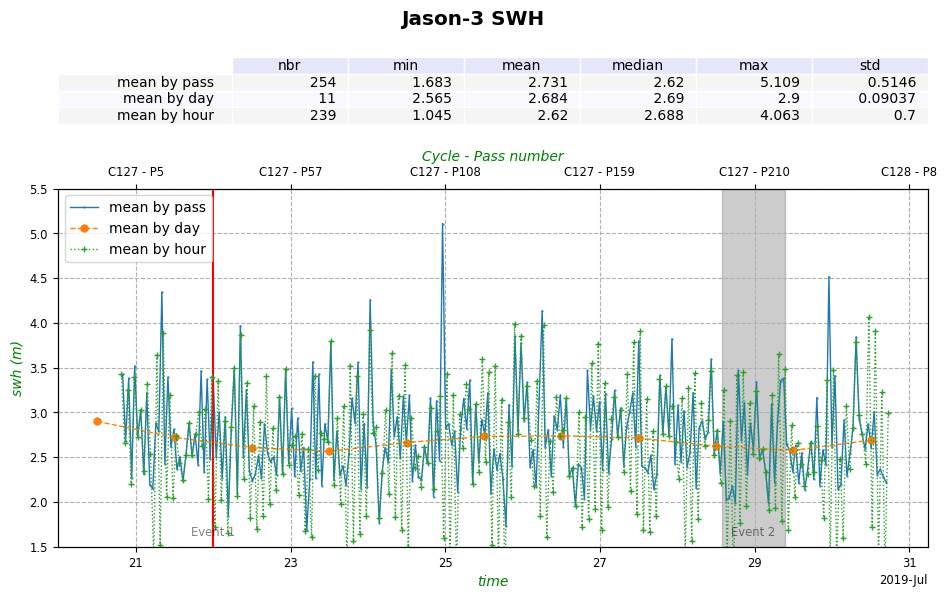
Time series of SWH: plot customization
We define events, that will be displayed on the plot at defined times:
[5]:
# Events
date_event_1 = DateHandler("2019/07/22T00:00:00")

event_1 = SimpleEvent(start=date_event_1, label="Event 1")

date_event_2_start = DateHandler.from_orf(orf_name, cycle_number, 200, pos="first")
date_event_2_end = DateHandler.from_orf(orf_name, cycle_number, 220, pos="last")

event_2 = RangeEvent(
    start=date_event_2_start,
    end=date_event_2_end,
    label="Event 2",
    params={"color": "grey"},
)
We specify text parameters to customize the plot:
[6]:
# Text params
text = TextParams(
    xlabel={"color": "g", "style": "italic"},
    ylabel={"color": "g", "style": "italic"},
    legend={"fontsize": "medium", "labels": "mean by pass"},
    title={"t": "Jason-3 SWH", "size": "x-large", "weight": "bold"},
)
We create the plots and add some settings:
[7]:
# Plot mean by day
sla_day_plot = CasysPlot(
    data=ad,
    data_name="SWH mean by day",
    stat="mean",
    plot_params=PlotParams(
        color="tab:orange", line_style="--", marker_style="o", marker_size=5
    ),
    text_params=TextParams(legend={"labels": "mean by day"}),
)
sla_day_plot.add_stat_bar()

# Plot mean by hour
sla_hour_plot = CasysPlot(
    data=ad,
    data_name="SWH mean by hour",
    stat="mean",
    plot_params=PlotParams(
        color="tab:green", line_style=":", marker_style="+", marker_size=5
    ),
    text_params=TextParams(legend={"labels": "mean by hour"}),
)
sla_hour_plot.add_stat_bar()

# Plot mean by pass
sla_pass_plot = CasysPlot(
    data=ad,
    data_name="SWH mean by pass",
    stat="mean",
    plot_params=PlotParams(grid=True, y_limits=(1.5, 5.5), color="tab:blue"),
)
# Merge the 3 plots
sla_pass_plot.add_plot(sla_day_plot, shared_ax="all")
sla_pass_plot.add_plot(sla_hour_plot, shared_ax="all")

# Add settings
sla_pass_plot.set_ticks(position="top", fmt="CP")
sla_pass_plot.add_event(event_1)
sla_pass_plot.add_event(event_2)
sla_pass_plot.set_text_params(text)
sla_pass_plot.add_stat_bar()

# show
sla_pass_plot.show()
[7]:
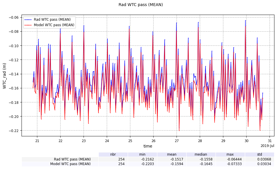
Merging time series Model WTC and Rad WTC
Here we merge two time series calculating mean statistic on Rad WTC and Model WTC by pass:
[8]:
wtcrad_pass_plot = CasysPlot(
    data=ad, data_name="Rad WTC pass", stat="mean", plot_params=PlotParams(grid=True)
)

wtcrad_pass_plot.add_stat_bar(position="bottom")

wtcmod_pass_plot = CasysPlot(data=ad, data_name="Model WTC pass", stat="mean")

wtcmod_pass_plot.add_stat_bar(position="bottom")

wtcrad_pass_plot.add_plot(wtcmod_pass_plot)
wtcrad_pass_plot.show()
[8]: