Comparing winds and waves
Lively Data : May 15, 2004
Comparing two series of measurements can be interesting, either from two different datasets at the same time (e.g. wave height and wind speed), or the same dataset at two different times.
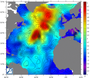
The Live Access Server allow to compare data, by substraction ("Comparison plot", to use only with the same type of data!), overlay ("Overlay plot", with a color-coded map for one variable, and contours for the second variable), or side-by-side plotting ("adjacent plot").
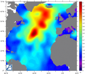
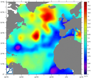
Comparison of Jason-1 wind speed and wave height. To plot such maps, choose a variable (here, Jason-1 wind speed modulus), clik on "compare two" in the left side menu, and choose the second variable (here Jason-1 significant wave height). Then, you can select outputs : top, "Overlay plot", with the wave height in color and wind speed as contours ; bottom, adjacent plot, with wave height left, and wind speed right.
 Use the Live Access Server


